


Presentational React components for AI chat interfaces.
@re-cinq/bowman-ui provides props-driven chat UI building blocks - message rendering, composer, conversation list, app shell - with no authentication, data-fetching, routing, or i18n dependencies. Consumers supply data and labels; the components render them.
The name follows the pairing the org chose: HAL Engine is the engine that thinks, Bowman is the face that talks to you.
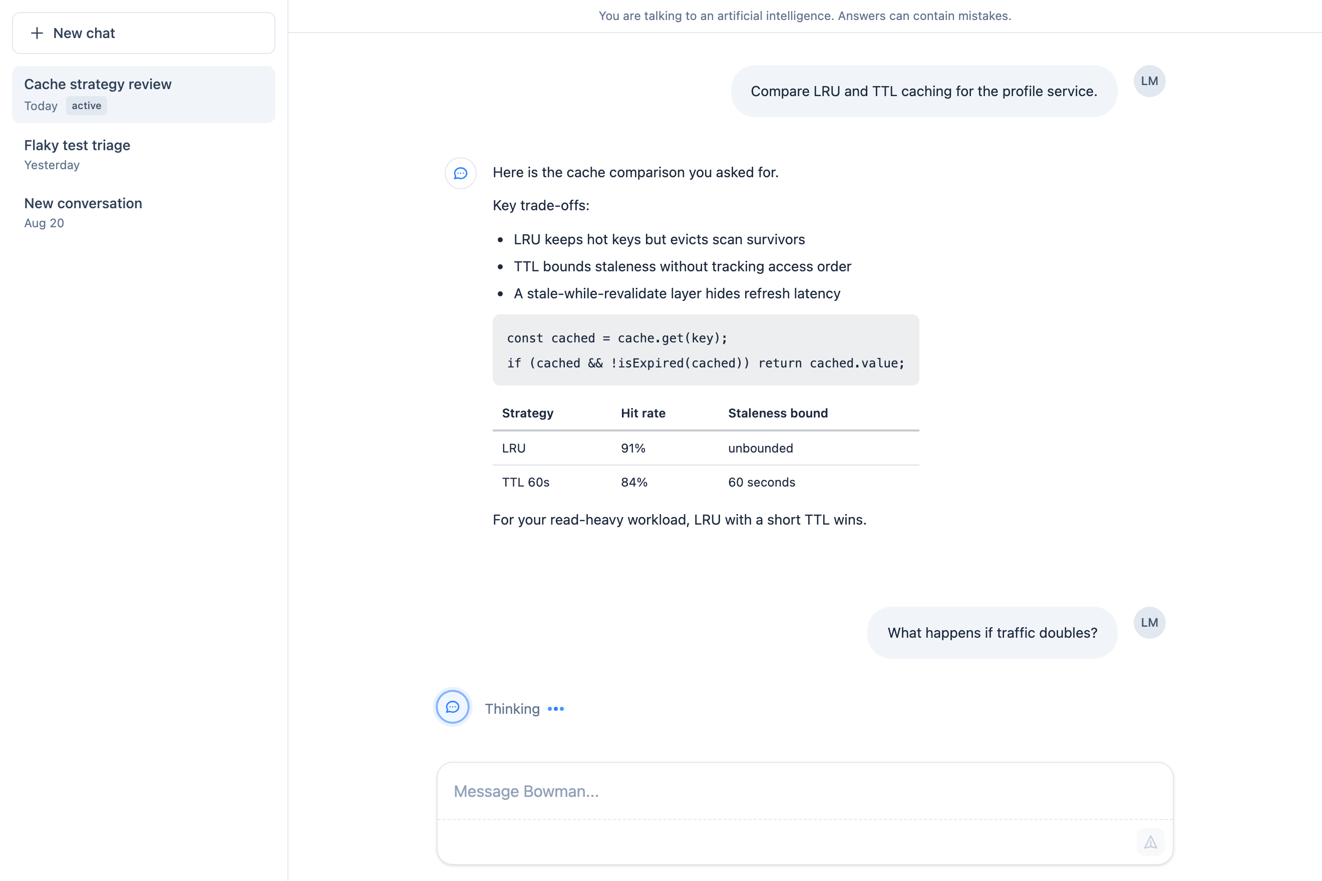
One surface, every piece: sidebar, transcript, and composer, rendered through the library's own components.
The component documentation, built from the packed package, is published at https://re-cinq.github.io/bowman-ui/; the chat fixture behind the screenshots is at ?view=chat.
npm install @re-cinq/bowman-uiEvery version is published from this repository's CI with npm provenance, so npm audit signatures can verify that what you installed was built by .github/workflows/publish.yml from the tagged commit.
- React and React DOM
^19.0.0as peer dependencies. That range is what the components are tested against (React 19.3.0) - it is not a claim of React 18 support. - Node.js
>=20.9.0to consume the package (its publishedenginesfloor). Developing this repo needs>=22, pinned in.nvmrcand CI.
Add two lines to your app's CSS entry:
@import "@re-cinq/bowman-ui/styles.css";
@source "../node_modules/@re-cinq/bowman-ui/dist";
(Adjust the @source path so it points at the installed dist relative to your CSS file.)
Tailwind CSS v4 is required: the stylesheet ships only what Tailwind cannot generate from a class name - four animation keyframes (bowman-fade-in, bowman-toast-fade-in, bowman-fade-dot, bowman-pulse-subtle) with their utility rules, the bowman-md-* markdown element styling and the bowman-sr-only rule that hides the markdown link notice, Toast's live region, ConversationList's plain title and useFocusGroups' announcement region, and an unconditional prefers-reduced-motion rule. Everything else on the components - layout, color, dark: variants - is plain Tailwind utility class names in the built files, and your own Tailwind v4 build generates their CSS by scanning the installed dist. That is what the @source line is for: Tailwind v4 does not scan node_modules by default, so without it the components render unstyled. How dark: resolves (media query or class strategy) stays your build's decision.
styles.css itself is plain CSS - no Tailwind at-rules - so a non-Tailwind consumer can import it too, but must then supply the utility styles the components reference by other means.
Every theme colour the components paint - the send button and primary Button fill, the streaming circle's tint and border, the focus ring and the composer's focus glow, the active row's surface, the pulse animation - is read through one of fifteen theme-colour --bowman-* custom properties (of the forty-four the package exposes), each with today's palette value as its var() fallback. Set the ones you want at :root, or on any wrapper to scope a theme to part of the page:
:root {
  --bowman-accent: #b7410e;
  --bowman-accent-dark: #c2410c;
  --bowman-accent-hover: #9a3412;
  --bowman-accent-hover-dark: #ea580c;
  --bowman-focus-ring: #b7410e;
  --bowman-focus-ring-dark: #fb923c;
}

.custom-theme {
  --bowman-active: #fdebdc;
  --bowman-active-dark: #3b1a0d;
  --bowman-surface: #fffaf5;
  --bowman-surface-dark: #2a1a10;
  --bowman-border: #eadbcd;
  --bowman-border-dark: #4a3020;
}
The neutral chrome has its own roles - --bowman-surface, --bowman-surface-hover, --bowman-control-hover, --bowman-border, --bowman-ring-offset and the text tiers --bowman-text-strong, --bowman-text-body, --bowman-text-secondary, --bowman-text-muted, --bowman-text-subtle, each with a -dark twin - so you can move the panels off pure white and the borders off slate-200 the same way. Two semantic roles sit beside them - --bowman-danger and --bowman-success, each with a -soft surface and -dark twins - for the selected thumbs, the copied check, the delete hover and the error icon. docs/design-notes.md § Theming lists all forty-four with the fallback each ships.
- Pick the scope. Set the properties on
:rootin your own stylesheet when the whole app is one theme, or on a wrapper class (.custom-theme,[data-tenant="acme"]) when one build serves several. The package declares no--bowman-*value anywhere, so either scope wins on plain inheritance and there is no specificity to beat. - Start with the accent.
--bowman-accent,--bowman-accent-hoverand--bowman-focus-ringrecolour the send button, the primary buttons, the thinking dots and every focus ring. Add--bowman-accent-soft,--bowman-accent-border,--bowman-accent-glowand--bowman-pulse-outlinefor the streaming circle and the composer's focus glow, and--bowman-activefor the selected conversation row. - Then the chrome.
--bowman-surfaceand--bowman-bordermove the panels, sidebar, composer and chips off pure white and slate-200;--bowman-surface-hoverand--bowman-control-hoverare the two hover surfaces;--bowman-ring-offsetshould match whatever--bowman-surfaceis, so focus rings keep their gap; the five text tiers (--bowman-text-strong,--bowman-text-body,-secondary,-muted,-subtle) run from strongest to faintest and must keep that order for contrast. - Set the
-darktwin of every property you changed. Each token has a-darkname read by the components' existingdark:variants; a property you set without its twin re-themes light mode and leaves dark mode on the shipped fallback. Whetherdark:followsprefers-color-schemeor a class is still your Tailwind build's decision. - Keep the fixed colours in mind. Only the roles above are tokens. The shell ground, the
avatar circles at rest, the user avatar, the toast and the error retry button keep their
slate and white utilities; if your palette needs those moved too, override the palette
variables (
--color-slate-900and friends) in your Tailwind theme, which recolours every use rather than one role.
A complete theme is the union of the two blocks above plus their -dark twins; the chat
demo's examples/chat-demo/src/custom-theme.css is a worked example that sets all forty-four.
Override none and the package resolves to the same Tailwind theme variables it used before the tokens existed, byte for byte - nothing declares a --bowman-* value, so there is no cascade to fight. Forty-two of the tokens form twenty-one light/dark pairs (--bowman-accent and --bowman-accent-dark, --bowman-focus-ring and --bowman-focus-ring-dark, ...), the -dark half read by the components' dark: variants, so your build's dark-mode strategy applies to the tokens unchanged; set both halves for a theme that holds in both modes. Two have no twin: --bowman-pulse-outline, because the pulse keyframe paints one outline in both modes, and --bowman-text-on-accent, the one text colour on the accent surface in both modes. --bowman-active colours the active row's background and its label reads --bowman-text-strong, so keep --bowman-active in contrast with --bowman-text-strong in light mode and --bowman-active-dark with --bowman-text-strong-dark in dark mode. The full table - every name, fallback and site - is in docs/design-notes.md § Theming.
Every screen in this package is assembled the same way: the consumer owns the entries and the busy flag, the components render them and report what the user did. This is the whole surface for a single conversation - the sidebar, the transcript with its required AI disclosure, and the composer:
import { useState } from "react";
import {
  AppShell,
  AppSidebar,
  ChatComposer,
  ChatMessageList,
  ConversationList,
  type AssistantChatEntry,
  type UserChatEntry,
} from "@re-cinq/bowman-ui";

type Entry = UserChatEntry | AssistantChatEntry;

const labels = {
  aiDisclosure: "You are talking to an artificial intelligence. Answers can contain mistakes.",
};

export function ChatScreen() {
  const [entries, setEntries] = useState<Entry[]>([]);
  const [busy, setBusy] = useState(false);

  const send = async (text: string) => {
    setEntries((current) => [...current, { id: crypto.randomUUID(), role: "user", content: text }]);
    setBusy(true);
    const reply = await askYourEngine(text);

    setEntries((current) => [
      ...current,
      { id: crypto.randomUUID(), role: "assistant", content: reply, isStreaming: false },
    ]);
    setBusy(false);
  };

  return (
    <AppShell
      brand="Your app"
      renderSidebar={({ close }) => (
        <AppSidebar brand="Your app">
          <ConversationList items={[{ id: "1", title: "Today" }]} activeId="1" onSelect={close} />
        </AppSidebar>
      )}
    >
      <div className="flex h-full min-h-0 flex-col">
        <ChatMessageList entries={entries} userInitials="AB" labels={labels} busy={busy} />
        <div className="mx-auto w-full max-w-3xl px-4 pb-4">
          <ChatComposer onSubmit={(text) => void send(text)} busy={busy} />
        </div>
      </div>
    </AppShell>
  );
}
askYourEngine stands for your adapter - a fetch, a socket, an SDK call. To stream instead of
waiting, append the assistant entry with isStreaming: true and empty content as soon as the
reply starts, hand ChatMessageList a new array on every delta, and flip the flag to false
on commit; examples/chat-demo does exactly that over a canned reply.
Two behaviours the components own so the adapter does not have to: ChatComposer submits on
Enter, Ctrl+Enter or Cmd+Enter and inserts a newline on Shift+Enter or Alt+Enter (a press
during IME composition is ignored), and the copy button on each message writes to the
clipboard itself, then shows a two-second confirmation. onCopy is a notification, fired
whether or not the write succeeded - an insecure context has no clipboard - so use it for a
toast, not for copying.
The list has no "new conversation" control and no onNew prop: that control is yours, which is
why the minimal app above has none. Put your own control above ConversationList inside
AppSidebar's children, and call the close that renderSidebar receives so the mobile drawer
shuts, the same way onSelect={close} already does; add PlusIcon to the import list:
renderSidebar={({ close }) => (
  <AppSidebar brand="Your app">
    <button
      type="button"
      onClick={() => {
        startConversation();
        close();
      }}
    >
      <PlusIcon className="h-4 w-4" />
      New chat
    </button>
    <ConversationList items={[{ id: "1", title: "Today" }]} activeId="1" onSelect={close} />
  </AppSidebar>
)}
startConversation is yours as well. PlusIcon comes from the package and is decorative beside
the visible text; styling the control is the consumer's job, as
examples/chat-demo/src/docs/HeroPreview.tsx shows.
examples/chat-demo is the worked consumer: a standalone Vite app that installs this package from a freshly packed tarball (never the source tree, never the registry) and composes AppShell, AppSidebar, ConversationList, ChatMessageList, ChatComposer and Toast into a full chat screen, verified by a Playwright suite that runs in a real Chromium and a real WebKit. One command builds the package, packs it, installs the tarball into a temp copy outside the repo tree and runs the whole proof:
npm run consumerPass -- --keep to retain the temp directory and tarball for debugging.
examples/rsc-fixture is the App Router consumer: a standalone Next.js 16 app (Turbopack, default config) that installs this package from a freshly packed tarball and compiles it with next build, importing icons from a server component and rendering ChatMessage - a "use client" component - as its child. The check asserts that a plain HTTP response from next start already carries the rendered <svg>, before any hydration. One command runs the whole proof:
npm run rscPass -- --keep to retain the temp directory and tarball, and -- --expect-failure to prove the guard goes red when a dist/ file loses its directive.
A React server component cannot pass a function across the client boundary - AppShell
(renderSidebar, onMobileSidebarOpenChange), AppSidebar (renderNavLink, onNavigate, a
SidebarNavItem's icon), Button and IconButton (onClick, and the icon component),
ChatComposer (onSubmit), ChatMessage and ChatMessageList (onCopy, onFeedback, the
assistantMessageFrom label, and on ChatMessageList alone renderEntryFooter and describeTool), ConversationList (renderLink, onSelect, onDelete, the
deleteConversation label), ErrorBoundary (onError), PromptChips (onPick), SearchField
(onChange), Toast (onClose) and ToolActivity (describeTool) accept function-valued props,
so an App Router consumer supplies those props from a "use client" file (measured on Next 16.3.3;
the verbatim build error is recorded in docs/design-notes.md § RSC fixture). An object literal
crosses fine - ChatMessageList's attribution map, element-valued avatars included - which is why
per-entry attribution is a lookup table and not a render prop.
ConversationList has no onNew; the new-conversation control is the consumer's, as shown under
Minimal app.
ChatMessage accepts only user and assistant entries - passing a ThinkingChatEntry or ToolChatEntry is a compile error, never a silent null render. A ChatEntry[] therefore needs a type guard before mapping:
import {
  ChatMessage,
  type AssistantChatEntry,
  type ChatEntry,
  type UserChatEntry,
} from "@re-cinq/bowman-ui";

const isRenderable = (entry: ChatEntry): entry is UserChatEntry | AssistantChatEntry =>
  entry.role === "user" || entry.role === "assistant";

entries
  .filter(isRenderable)
  .map((entry) => <ChatMessage key={entry.id} entry={entry} userInitials="AB" />);
The components own no scroll position: keeping the transcript pinned to the newest message while a reply streams is the consumer's job.
The library treats assistant content as untrusted: the model that writes it has tool results from a third-party system in its context, so which URLs become clickable is the library's decision, not the model's. ChatMessage therefore renders markdown through its own URL policy instead of react-markdown's default filter. The default:
| Field | Default | Effect |
|---|---|---|
allowedSchemes |
["https", "mailto", "tel"] |
Any other scheme (http, javascript:, data:, ...) renders as plain text, never an anchor |
allowRelativeUrls |
false |
[text](/api/logout) renders as text; protocol-relative //host and authority-less https:/api/logout are always rejected |
linkTarget |
"_blank" |
Anchors open in a new tab, with a visually-hidden linkOpensInNewTab notice for screen readers |
allowImages |
false |
 renders the alt text; no image request leaves the reader's browser |
A rejected URL renders its link text in a <span> - never an empty anchor, which would reload the page when clicked. Every rendered anchor carries rel="noopener noreferrer", even with linkTarget: "_self", so the chat URL never leaks in a Referer header. remark-gfm autolink literals (a bare https://... or support@... in prose) pass through the same policy; note that a bare www.example.com autolinks as http://, so it stays text unless http is allowed.
Override fields per ChatMessage through the markdown prop, merged over defaultMarkdownPolicy:
<ChatMessage entry={entry} userInitials="AB" markdown={{ allowedSchemes: ["https", "http"] }} />Setting allowImages: true renders <img> for scheme-allowed sources - and costs a network request at render time (React preloads image sources), so opt in only when the image host is trusted. Rendering markdown outside ChatMessage uses the same pair the component uses internally:
import ReactMarkdown from "react-markdown";
import remarkGfm from "remark-gfm";
import { createMarkdownComponents, createUrlTransform } from "@re-cinq/bowman-ui";

<ReactMarkdown
  remarkPlugins={[remarkGfm]}
  components={createMarkdownComponents({ policy })}
  urlTransform={createUrlTransform(policy)}
>
  {content}
</ReactMarkdown>;Every piece on screen is one export:
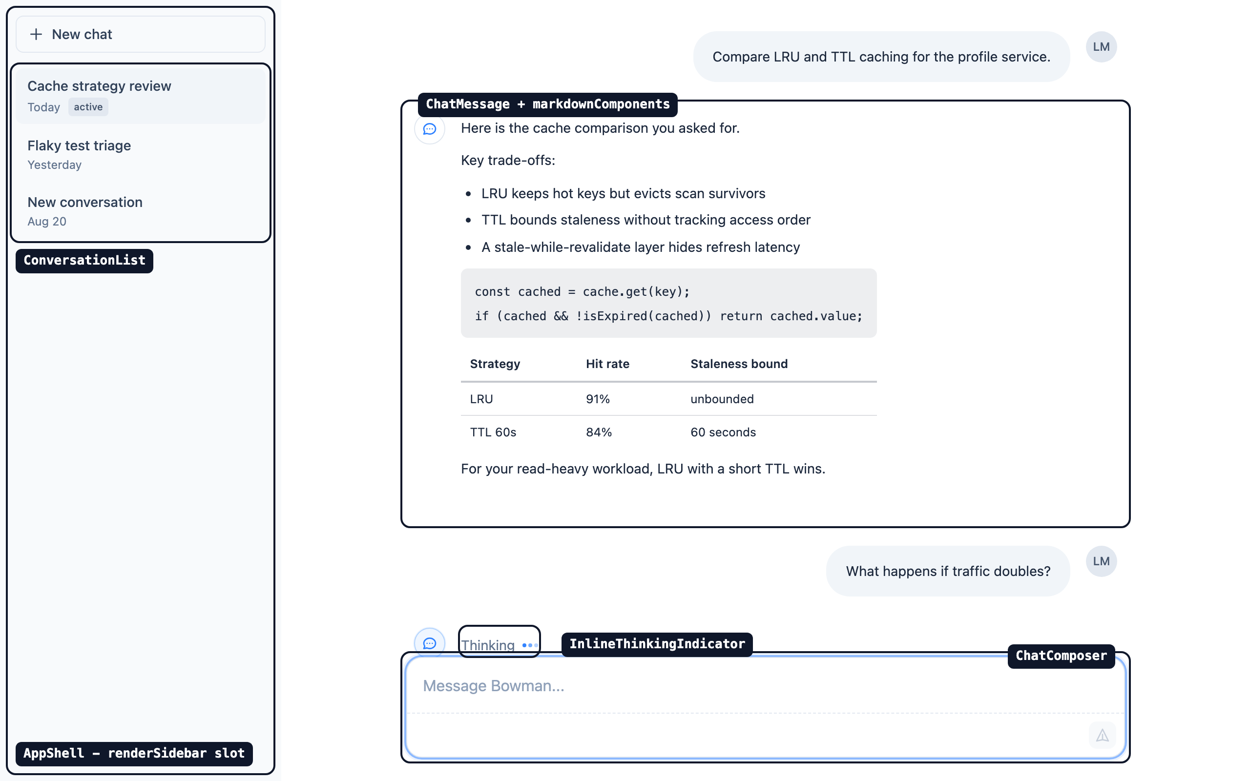
Data flows one way in and one way out - the package never talks to a backend, it only renders what it is handed and reports what the user did:
an engine that thinks  --(protocol events)-->  your adapter  --(ChatEntry[])-->  bowman-ui, the face that talks
an engine that thinks  <--(messages)--------  your adapter  <--(onSubmit, onCopy, onFeedback, onDelete)--  bowman-ui
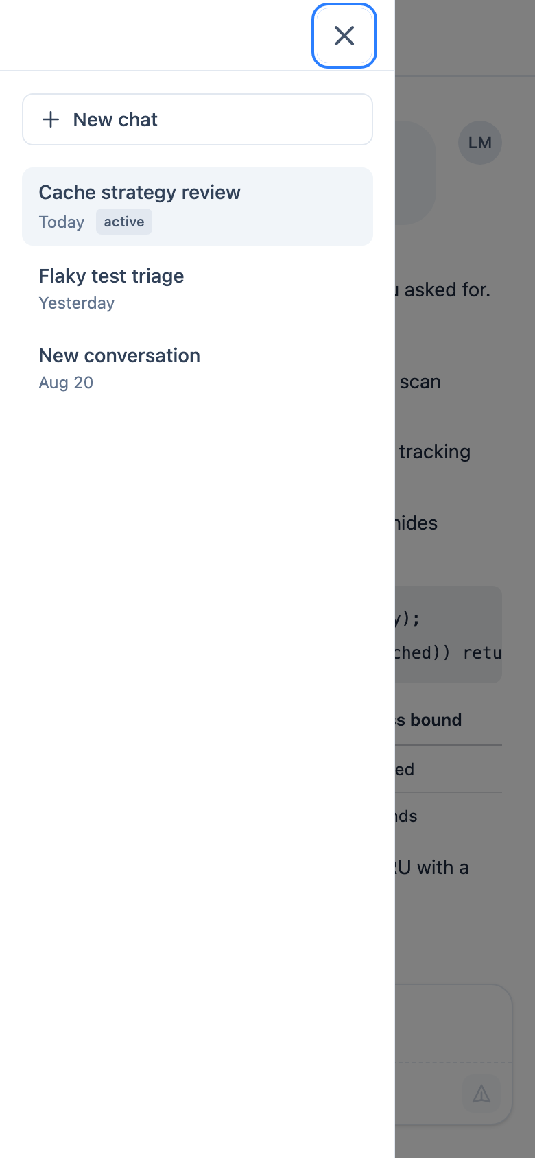
On a phone the sidebar becomes a focus-trapped drawer behind the hamburger. It opens on request - every time, without argument:
Each labelled component takes labels?: Partial<XLabels>, shallow-merged per key over complete English defaults (defaultChatComposerLabels, defaultConversationListLabels, ...); three deliberate exceptions carry their strings as plain props instead (Toast's message, the icons' ariaLabel, useFocusGroups' announce - the design notes § Labels). A label that interpolates a value is a function - deleteConversation: (title: string) => string - never a template string with placeholders, so word order and plural rules stay with whoever writes the string.
Translating the package to another language therefore means supplying your reviewed catalogue through those props. bowman-ui ships no locale files and no i18n runtime on purpose (see the design notes § Labels): the consumer app is the only place the copy can be reviewed. A full catalogue is a typed object handed over as slices - the label types are exported, so a missing key is a compile error. The Spanish wording below is illustrative, not a reviewed translation (the demo app itself ships English-only; a real catalogue belongs to the consumer app that can review it):
import {
  ChatComposer,
  ConversationList,
  type ChatComposerLabels,
  type ConversationListLabels,
} from "@re-cinq/bowman-ui";

const catalogue: { composer: ChatComposerLabels; conversationList: ConversationListLabels } = {
  composer: {
    composerInput: "Tu mensaje",
    composerPlaceholder: "Responder...",
    send: "Enviar mensaje",
    composerBusyHint: "Puedes seguir escribiendo. El envío espera a que el asistente termine.",
  },
  conversationList: {
    conversations: "Conversaciones",
    noConversations: "Aún no hay conversaciones",
    loadingConversations: "Cargando conversaciones",
    deleteConversation: (title) => `Eliminar la conversación: ${title}`,
  },
};

<ChatComposer onSubmit={handleSubmit} labels={catalogue.composer} />;
<ConversationList items={items} labels={catalogue.conversationList} />;
An i18n library plugs into the same seam - with next-intl's useTranslations (or any lookup of your own):
const t = useTranslations("chat");

<ChatComposer
  onSubmit={handleSubmit}
  labels={{ send: t("send"), composerPlaceholder: t("placeholder") }}
/>;
A lookup that produces undefined is safe: the merge helper treats an explicit undefined override the same as a missing key, so the English default fills in rather than undefined reaching the DOM.
23 SVG icon components (SearchIcon, ChatIcon, LoadingIcon, ...) are exported from the package root, each typed with the public IconProps ({className?, ariaLabel?, strokeWidth?}). Omit ariaLabel for a decorative icon (aria-hidden="true"); pass it for a meaningful one (role="img" plus aria-label). strokeWidth defaults to 2 (DatabaseIcon to 1.5). LoadingIcon spins via Tailwind's core animate-spin utility - your Tailwind build generates it when scanning the installed dist (see Styles); it needs nothing from styles.css. Its default ariaLabel of "Loading" is the icon set's only user-visible string, overridable per call site.
There is no brand mark in the set. A consumer who wants one supplies it through the assistantAvatar slot described in the design notes (decision 3) - the library does not ship a fallback logo.
Five hooks ship beside the components, each pure (no console, no network, no storage except useSidebarState):
useFocusGroups(); // F6 / Shift+F6 cycles focus through [data-focus-group] sections, by data-focus-group-order then DOM order
<header data-focus-group="header" data-focus-group-order="0">...</header>
<main data-focus-group="main" data-focus-group-order="1">...</main>

const triggerRef = useRef<HTMLButtonElement>(null);
const containerRef = useFocusTrap(isOpen, onClose, triggerRef); // modal surfaces only: Tab is trapped, Escape closes and refocuses the trigger
<div ref={containerRef}>...</div>

const prefersReducedMotion = useReducedMotion(); // pass a boolean to override the OS preference
const animationDuration = prefersReducedMotion ? 0 : 300;

const debouncedQuery = useDebounce(query, 300);

const { isOpen, setIsOpen, toggle, open, close, isHydrated } = useSidebarState("chat", { storagePrefix: "olt-" }); // stored under `${storagePrefix}${key}`; cross-tab writes apply until the first local setnpm ci
npm run lint
npm run typecheck
npm test
npm run buildCONTRIBUTING.md has the branch, commit and pull-request conventions and the gates a change must pass.
A release is a GitHub Release with a vX.Y.Z tag, nothing more: publishing it runs publish.yml, which re-runs every gate at the tag, stamps the tag's version into package.json (the field on main is the placeholder 0.0.0), and stages it on npm with provenance over OIDC trusted publishing; a maintainer then approves the staged version on npmjs.com with 2FA, and only then is it installable. No version is ever bumped by hand, no token is stored anywhere, and nothing CI does alone can ship. CONTRIBUTING.md has the clicks.
Two TypeScript installs exist on purpose: typescript (~6.x) feeds the lint stack, because typescript-eslint caps its peer range below TypeScript 7, while the typescript7 alias (npm:typescript@~7.0.2) is the actual compiler that build and typecheck invoke. Do not "clean up" the alias, and do not enable type-aware linting (recommendedTypeChecked) without revisiting this split - the linter would type-check with a different compiler major than the build.
The components carry the roles, names and live regions described above, and the test suite checks that markup. What no test can check is what a screen reader actually says: docs/accessibility/README.md is the procedure for a human to find out, and docs/accessibility/ is where the dated record goes. No record has been committed yet, so the announced behaviour is documented, not verified by a listener. A record is welcome from anyone who runs the pass; CI validates its shape.
The library renders model-authored markdown into a customer-facing chat, so the reports that matter are XSS, sanitizer bypass, and markdown-pipeline dependency advisories - measured against the scheme allowlist and rel="noopener noreferrer" policy described in Links in model output. Do not open a public issue for a vulnerability. Report it privately to security@re-cinq.com; we acknowledge within 48 hours. Full intake, scope, and supported-versions detail is in SECURITY.md.
The SVG icon artwork in this package is adapted from two open-source icon sets, not drawn from scratch:
The glyphs are modified derivatives, and there is no runtime or import dependency on either project - only the path data was adapted. The upstream copyright and license notices are reproduced in THIRD-PARTY-NOTICES.md, which ships in the published package.
Apache-2.0