
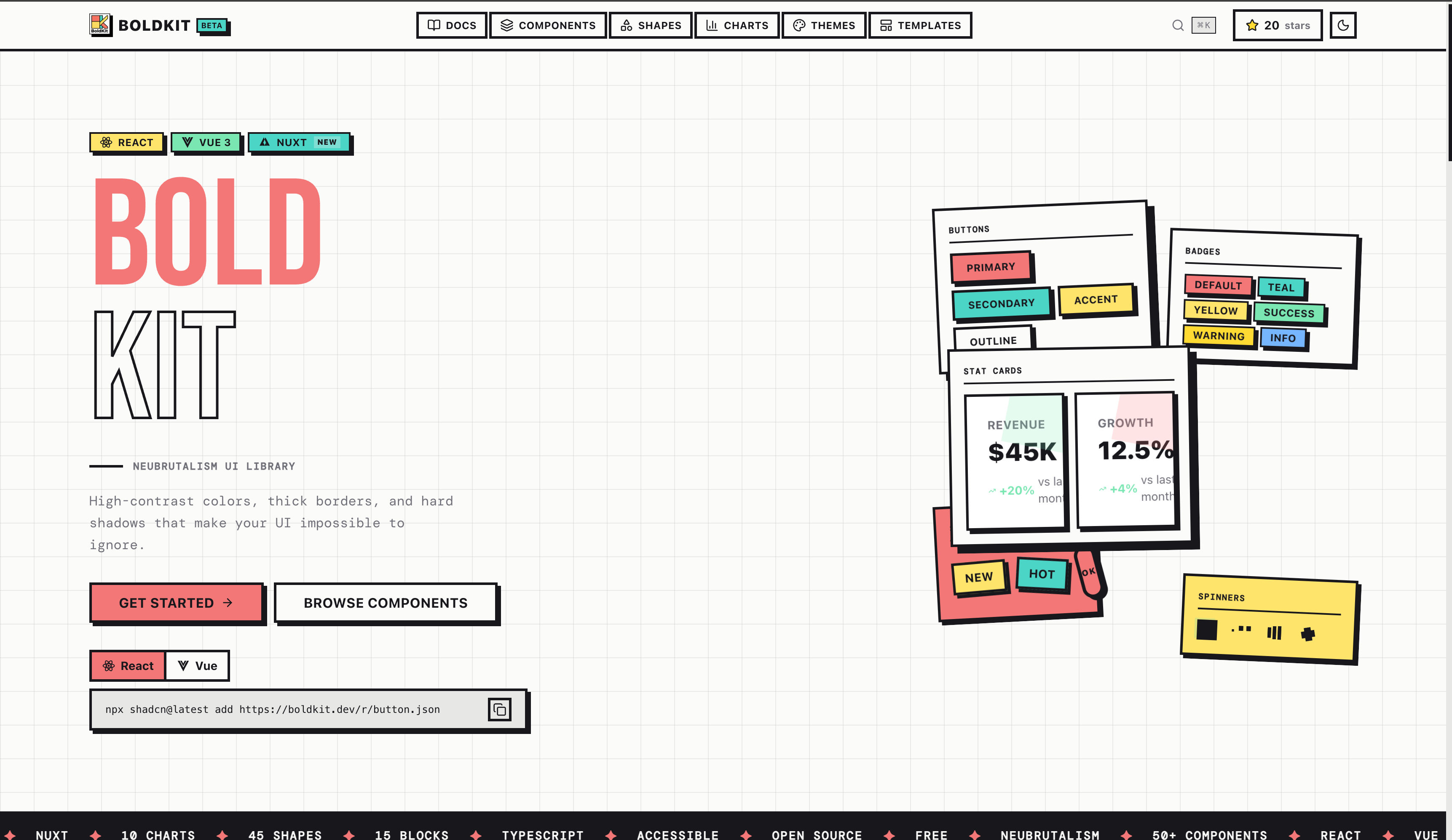
Bold. Raw. Beautiful.
A neubrutalism component library for React and Vue 3, built on shadcn/ui.






Website · Documentation · Components · Charts · Shapes
| Component | Description |
|---|---|
| Trace | The steps an agent takes inside a turn (reasoning, tool calls, sources, plans). Running steps shimmer, pending steps go dashed, failed steps go red; lines expand into detail and nest. |
| Code Block | Code, terminal output, logs and diffs. Copy button, line numbers, wrapping, added / removed / highlighted lines, and a small size for tool output inside a Trace. |
Also in v3.6.1: theme reveal (setTheme(theme, { origin }) wipes the new theme in as a circle from the click), Bubble typing and streaming, and fixes for uncontrolled Vue overlays (Dialog, Sheet, Popover, Collapsible, Dropdown Menu) and for border colour utilities that never applied.
| Component | Description |
|---|---|
| Chat kit | MessageScroller (auto-follow, jump-to-latest, history prepend), Message, Bubble, Attachment, Marker in one chat item |
| Toast | First-party brutalist toast stacks with toast() / toast.promise(), stacking and swipe |
| Questionnaire | One question per screen: single, multiple, text, "Other…", skip, conditional steps, keyboard shortcuts |
| Number Field | Steppers, min/max/step, keyboard and wheel control, Intl currency and percent formatting |
Plus 14 installable theme presets (@boldkit/theme-<name>), a one-command boldkit base item, unified radix-ui, @lucide/vue, Reka UI 2.11, and React 19.3 <ViewTransition> support.
Full history: CHANGELOG.md · Releases

70+ neubrutalism components, 14 chart types, 64 SVG shapes, 17 animated ASCII shapes, 23 canvas effects, and 15 math curve animations for React and Vue 3
Neubrutalism (or neo-brutalism) is a bold design aesthetic characterized by:
- Thick Borders - 3px solid borders that define elements
- Hard Shadows - Offset shadows with no blur (4px 4px 0px)
- Bold Colors - High-contrast, vibrant color palettes
- Raw Typography - Bold, uppercase text for emphasis
- Zero Radius - Square corners for that raw, unpolished look

| Feature | Description |
|---|---|
| 70+ Components | Buttons, Cards, Dialogs, Forms, Data Table, Combobox, Sidebar, Toast, and more |
| Chat & Agent UI | Message Scroller, Message, Bubble, Attachment, Marker, Trace, Code Block, Questionnaire |
| 14 Chart Types | Area, Bar, Horizontal Bar, Line, Pie, Donut, Radar, Radial Bar, Gauge, Sparkline, Funnel, Treemap, Sankey, Heatmap, with annotations and a PNG/SVG/CSV export toolbar |
| 64 SVG Shapes | Decorative shapes (geometric, organic, mathematical, mechanical) with interactive Shape Builder |
| 17 ASCII Shapes | Animated 3D ASCII art — Torus, Donut, Sphere, Cube, Helix, Trefoil Knot, Saturn, DNA, and more |
| Dot Matrix Studio | In-browser pixel art & animation editor with 10 presets, WebM/PNG/SVG/JSON export |
| 23 Canvas Effects | Animated canvas components — Mesh Gradient, Swirl, God Rays, Pulsing Border, Dither, Halftone, CRT, Truchet, Aurora, Flow Field, Plasma, Metaballs and more. Each pauses off-screen and in background tabs, caps its pixel budget, and honours prefers-reduced-motion. |
| Math Curve Components | Animated loaders, progress bars, and backgrounds powered by 15 mathematical curves |
| Motion System | Shared motion tokens, <Motion> / <Reveal>, stepped loading states, View Transition recipes; every animation honours prefers-reduced-motion |
| 15 Blocks & 7 Templates | Marketing and application page sections plus full-page templates (copy-paste from the docs) |
| React & Vue 3 | Full support for both frameworks |
| Nuxt Ready | SSR-compatible with shadcn-nuxt module |
| shadcn CLI | Install via shadcn (React) or shadcn-vue (Vue/Nuxt) |
| Accessible | Built on Radix UI (React) & Reka UI (Vue), with a published per-component WCAG matrix |
| Dark Mode & Themes | Light/dark, 14 installable theme presets, and a live Theme Builder |
| TypeScript | Complete type safety |
| Tailwind v4 | Modern CSS with latest Tailwind |
Install components from an AI agent or the terminal — both auto-detect React vs Vue:
# MCP (Claude Code, Cursor, VS Code, Windsurf, Codex, Gemini CLI, ...)
claude mcp add boldkit -- npx -y @boldkit/mcp

# CLI
npx boldkit add button card dialog
npx boldkit search "toast"
Full per-client setup: boldkit.dev/docs/mcp
Required first step: register the
@boldkitalias in yourcomponents.json. BoldKit components reference each other via scoped names like@boldkit/utils, and without the alias the CLI resolves these against shadcn's default registry (which doesn't ship them) and installs fail.
npx shadcn@latest init https://boldkit.dev/r/boldkit.jsonSets up the stylesheet, motion system, utils and fonts. Then add the alias below and install components.
React — add to components.json:
{
  "registries": {
    "@boldkit": "https://boldkit.dev/r/{name}.json"
  }
}
Vue — add to components.json:
{
  "registries": {
    "@boldkit": "https://boldkit.dev/r/vue/{name}.json"
  }
}# Install a component
npx shadcn@latest add @boldkit/button
# Install multiple components
npx shadcn@latest add @boldkit/button @boldkit/card @boldkit/input
# Install shapes
npx shadcn@latest add @boldkit/shapes
# Install the BoldKit theme (CSS variables)
npx shadcn@latest add @boldkit/styles
# Or a theme preset (14 available, e.g. ocean, candy)
npx shadcn@latest add @boldkit/theme-ocean# Install a component
npx shadcn-vue@latest add @boldkit/button
# Install multiple components
npx shadcn-vue@latest add @boldkit/button @boldkit/card @boldkit/input
# Install shapes
npx shadcn-vue@latest add @boldkit/shapes
# Install the BoldKit theme (CSS variables)
npx shadcn-vue@latest add @boldkit/styles
# Or a theme preset (14 available, e.g. ocean, candy)
npx shadcn-vue@latest add @boldkit/theme-oceanFor one-off installs without configuring the alias, you can pass the registry URL directly. Note: components with cross-references won't auto-install their BoldKit dependencies this way — you'll need to add each dependency manually.
# React
npx shadcn@latest add https://boldkit.dev/r/button.json

# Vue
npx shadcn-vue@latest add https://boldkit.dev/r/vue/button.jsonBoldKit's repository is also a shadcn GitHub registry — install any React component straight from the
repo with no components.json alias and no setup. Scoped cross-references like @boldkit/utils resolve
automatically (the CLI maps them to this same registry).
# Install a component — owner/repo/item
npx shadcn@latest add ANIBIT14/boldkit/button

# Install multiple
npx shadcn@latest add ANIBIT14/boldkit/button ANIBIT14/boldkit/card

# Pin to a tag, branch, or commit SHA for reproducible installs
npx shadcn@latest add ANIBIT14/boldkit/button#main

# Browse / preview before installing
npx shadcn@latest list ANIBIT14/boldkit
npx shadcn@latest view ANIBIT14/boldkit/button
npx shadcn@latest add ANIBIT14/boldkit/button --dry-run
GitHub install covers the React registry (components, charts, shapes, hooks, theme, utils). Vue 3 / Nuxt and canvas effects install via the hosted URLs above.
# 1. Add shadcn-nuxt module
npx nuxi@latest module add shadcn-nuxt

# 2. Initialize shadcn-vue (select Nuxt when prompted)
npx shadcn-vue@latest init

# 3. Install BoldKit components
npx shadcn-vue@latest add https://boldkit.dev/r/vue/button.json
nuxt.config.ts:
export default defineNuxtConfig({
  modules: ['shadcn-nuxt'],
  shadcn: {
    prefix: '',
    componentDir: './components/ui'
  }
})
Note: Some components (Drawer, Sonner, Command, Calendar, Chart) require
<ClientOnly>wrapper for SSR. See the Nuxt installation guide for details.
import { Button } from '@/components/ui/button'
import { Card, CardHeader, CardTitle, CardContent } from '@/components/ui/card'
import { Badge } from '@/components/ui/badge'

export function Example() {
  return (
    <Card>
      <CardHeader className="bg-primary">
        <CardTitle className="flex items-center gap-2">
          Welcome to BoldKit
          <Badge variant="secondary">New</Badge>
        </CardTitle>
      </CardHeader>
      <CardContent className="space-y-4">
        <p>Build bold, beautiful interfaces with ease.</p>
        <div className="flex gap-2">
          <Button>Primary</Button>
          <Button variant="secondary">Secondary</Button>
          <Button variant="accent">Accent</Button>
        </div>
      </CardContent>
    </Card>
  )
}<script setup lang="ts">
import { Button } from '@/components/ui/button'
import { Card, CardHeader, CardTitle, CardContent } from '@/components/ui/card'
import { Badge } from '@/components/ui/badge'
</script>
<template>
<Card>
<CardHeader class="bg-primary">
<CardTitle class="flex items-center gap-2">
Welcome to BoldKit
<Badge variant="secondary">New</Badge>
</CardTitle>
</CardHeader>
<CardContent class="space-y-4">
<p>Build bold, beautiful interfaces with ease.</p>
<div class="flex gap-2">
<Button>Primary</Button>
<Button variant="secondary">Secondary</Button>
<Button variant="accent">Accent</Button>
</div>
</CardContent>
</Card>
</template>
Forms & Inputs
- Button (7 variants, 5 sizes), Button Group
- Input, Input Group, Input OTP, Textarea, Label, Field
- Checkbox, Radio Group, Switch, Slider, Toggle, Toggle Group
- Select, Native Select, Combobox (single + multi)
- Number Field ✨ NEW
- Calendar, Date Picker, Date Range Picker, Time Picker
- Rating, Tag Input, Dropzone
- Multi-step Form (form state over the Stepper UI)
Chat & Agent UI
- Message Scroller, Message, Bubble (typing + streaming), Attachment, Marker ✨ NEW
- Trace (agent steps: reasoning, tool calls, plans) ✨ NEW
- Code Block (copy, line numbers, diffs, terminal output) ✨ NEW
- Questionnaire (one question per screen) ✨ NEW
Layout & Containers
- Card, Layered Card, Stat Card
- Dialog, Alert Dialog, Drawer, Sheet
- Accordion, Collapsible, Tabs
- Stepper, Resizable, Scroll Area, Aspect Ratio, Separator
- Empty State
Feedback & Status
- Alert, Badge, Progress (stepped + marquee), Skeleton (stamp, blocks, scan), Spinner
- Toast (first-party stacks) ✨ NEW, Sonner
- Tour
- Math Curve Loader, Math Curve Progress, Math Curve Background
Navigation
- Sidebar, Navigation Menu, Menubar, Breadcrumb, Pagination
- Dropdown Menu, Context Menu, Command Palette
- Popover, Tooltip, Hover Card
- Tree View, Carousel
Data Display
- Data Table (sort, filter, selection), Table
- Avatar, Kbd, Timeline
Charts (14 Types)
- Area, Bar, Horizontal Bar, Line, Pie, Donut
- Radar, Radial Bar, Gauge, Sparkline
- Funnel, Treemap, Sankey, Heatmap
- Chart annotations (reference lines, callouts, arrows) and Chart Toolbar (PNG / SVG / CSV export, fullscreen)
Decorative (Neubrutalism Special)
- Sticker (rotated labels), Marquee (scrolling ticker)
- 64 SVG Shapes (Geometric, Organic, Celestial, Mathematical, Mechanical, and more) with stepped animation presets
- 17 ASCII Shapes (Torus, Donut, Sphere, Cube, Helix, Trefoil Knot, Geodesic Dome, Saturn, DNA…)
- 23 Canvas Effects, Dot Matrix Studio, Shape Builder
Blocks & Templates (copy-paste)
- Marketing blocks: Hero, Feature Grid, Testimonials, Logo Cloud, CTA, Stats, Team, FAQ, Footer, Contact
- Application blocks: Auth Forms, Settings, Onboarding, Error Pages, Invoice
- Templates: Dashboard, Landing Page, Pricing, Blog, Portfolio, Product, Docs
Blocks and templates are copied from their docs pages; they are not registry items, so shadcn add can't install them.
15 animated mathematical curves (Lissajous, Hypotrochoid, Epitrochoid, Rose, Spirograph, and more) rendered as interactive UI elements — no external animation library required.
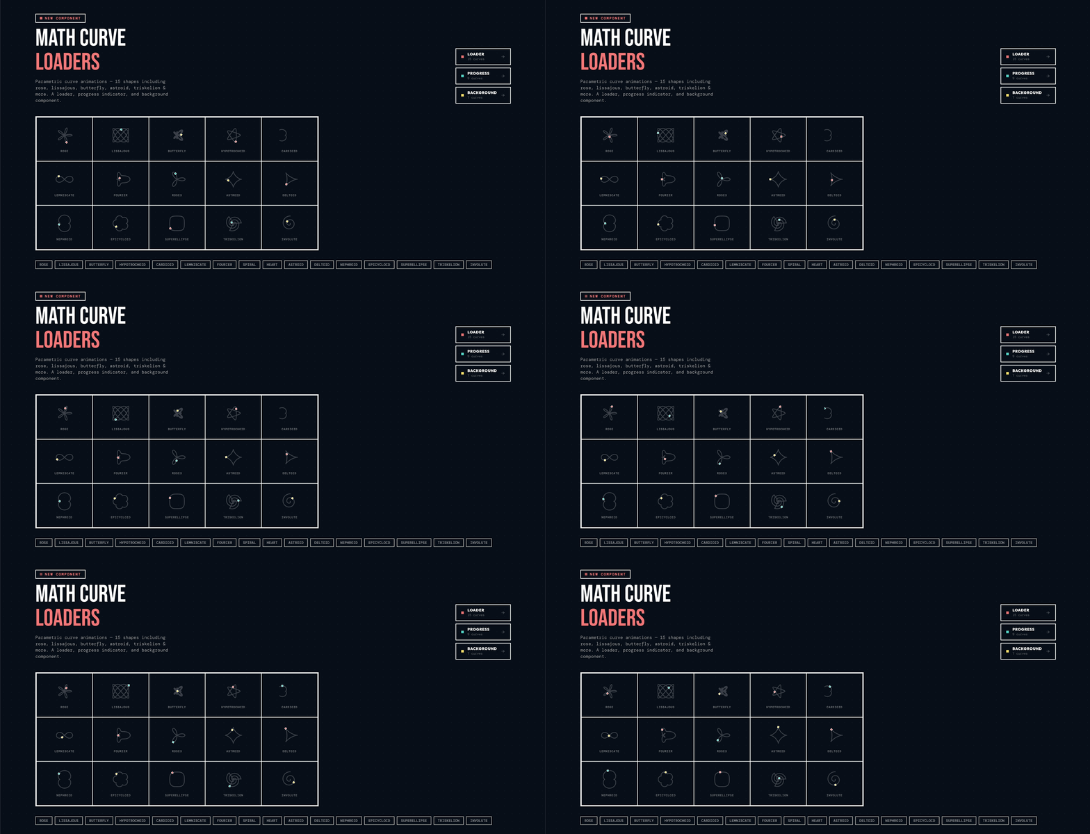
import { MathCurveLoader } from '@/components/ui/math-curve-loader'

<MathCurveLoader curve="lissajous" size="md" speed="normal" />
<MathCurveLoader curve="rose" size="lg" speed="slow" />
<MathCurveLoader curve="spiral" size="xl" speed="fast" />import { MathCurveProgress } from '@/components/ui/math-curve-progress'
<MathCurveProgress value={65} curve="lissajous" />
<MathCurveProgress value={40} curve="rose" showLabel />import { MathCurveBackground } from '@/components/ui/math-curve-background'
<MathCurveBackground curve="lissajous" opacity={0.15}>
<YourPageContent />
</MathCurveBackground>64 decorative SVG shapes across 8 categories for unique neubrutalism layouts:
import { BurstShape, HeartShape, LightningShape } from '@/components/ui/shapes'

<BurstShape size={100} className="text-primary" />
<HeartShape size={80} filled={false} strokeWidth={4} />
<LightningShape size={60} className="text-accent" /><script setup lang="ts">
import { BurstShape, HeartShape, LightningShape } from '@/components/ui/shapes'
</script>
<template>
<BurstShape :size="100" class="text-primary" />
<HeartShape :size="80" :filled="false" :stroke-width="4" />
<LightningShape :size="60" class="text-accent" />
</template>
The interactive Shape Builder lets you customize any shape's size, color, stroke width, and fill, then export it as SVG or copy it as JSX/Vue template code ready to paste into your project.
17 animated ASCII art components rendered with perspective projection, z-buffering, and Lambertian shading — no canvas, no WebGL, just text characters:
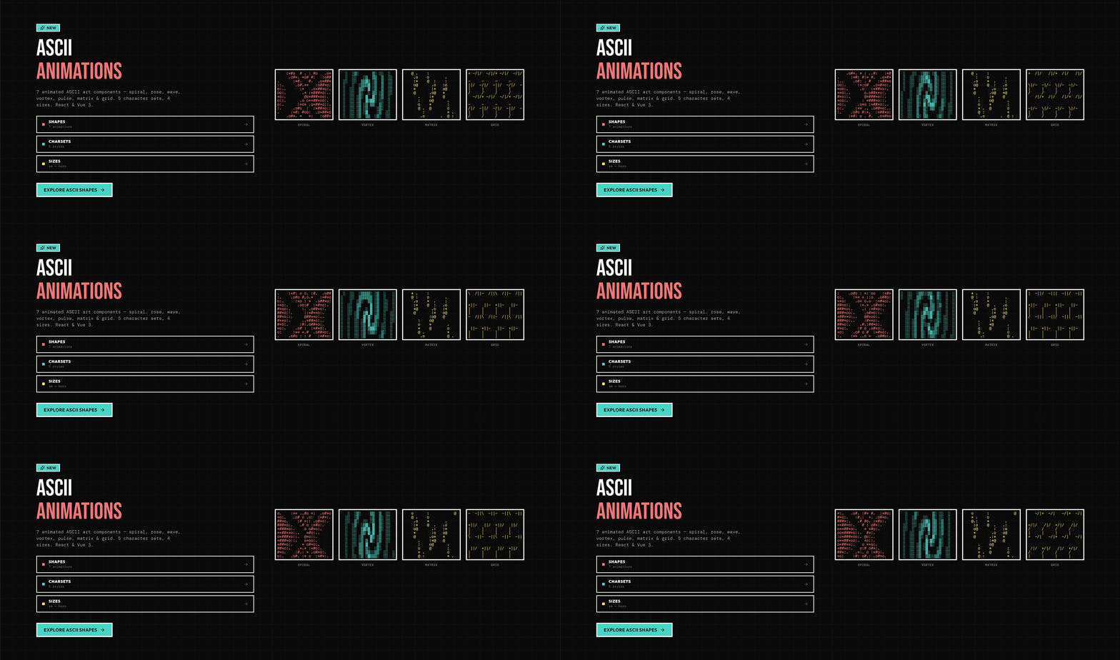
| Shape | Description |
|---|---|
AsciiTorus |
3D rotating torus with z-buffering and Lambertian shading |
AsciiDonut |
Classic donut.c doughnut — faithful a1k0n algorithm, hole always visible |
AsciiSphere |
Rotating globe with lat/lon grid texture and Lambertian shading |
AsciiCube |
Solid shaded cube rotating on two axes with back-face culling |
AsciiHelix |
Double helix with two strands and connecting rungs |
AsciiTrefoilKnot |
Trefoil knot tube with Frenet frames, z-buffer, and Lambertian shading |
AsciiGeodesicDome |
Frequency-3 icosahedron wireframe projected onto a sphere |
AsciiSaturn |
Planet with tilted solid ring system and Cassini division gap |
AsciiHyperboloid |
Two families of straight-line rulings on a ruled surface tower |
AsciiDNA |
B-form DNA double helix: 150° strand offset, 4 turns, tube backbone + rungs |
AsciiSpiral |
Archimedean spiral arms rotating continuously |
AsciiRose |
Rose curve r=cos(5θ) blooming and phase-shifting |
AsciiWave |
Multi-frequency sine interference pattern |
AsciiVortex |
Rotating density field collapsing toward center |
AsciiPulse |
Concentric rings expanding outward and fading |
AsciiMatrix |
Characters raining downward per column |
AsciiGrid |
Grid intersections pulsing with traveling waves |
import { AsciiTorus, AsciiDonut, AsciiSphere } from '@/components/ui/ascii-shapes'

// Basic usage
<AsciiTorus />

// With options
<AsciiDonut
  size="md"          // 'sm' | 'md' | 'lg' | 'hero'
  charset="classic"  // 'blocks' | 'braille' | 'classic' | 'line' | 'dots'
  speed="normal"     // 'slow' | 'normal' | 'fast'
  color="#e74c3c"    // any CSS color string
  animated={true}    // false = static snapshot, SSR-safe
/>

// Multicolor — cycles primary/secondary/accent/warning/info/success per row
<AsciiSphere size="lg" charset="classic" multicolor /><script setup lang="ts">
import { AsciiTorus, AsciiDonut } from '@/components/ui/ascii-shapes'
</script>
<template>
<AsciiDonut size="md" charset="classic" />
<!-- In Nuxt, wrap animated variants in <ClientOnly> -->
<ClientOnly>
<AsciiTorus size="lg" multicolor />
</ClientOnly>
</template># React
npx shadcn@latest add "https://boldkit.dev/r/ascii-shapes.json"
# Vue 3 / Nuxt
npx shadcn-vue@latest add "https://boldkit.dev/r/vue/ascii-shapes.json"Customize with CSS variables (works for both React and Vue):
:root {
  --primary: 0 84% 71%;       /* Coral */
  --secondary: 174 62% 56%;   /* Teal */
  --accent: 49 100% 71%;      /* Yellow */
  --destructive: 0 84% 60%;   /* Red */
  --shadow-color: 240 10% 10%;
  --radius: 0rem;             /* Keep it square! */
}
Visit the Theme Builder to create custom themes.
- React 19 - Latest React with concurrent features
- Radix UI - Accessible primitives
- Recharts - Data visualization
- Vue 3 - Composition API with
<script setup> - Reka UI - Accessible primitives (Radix port for Vue)
- vue-echarts - Data visualization
- Nuxt - Vue meta-framework with SSR support
- shadcn-nuxt - Official Nuxt module for shadcn-vue
- Auto-imports - Components auto-imported from
components/ui - VueUse - SSR-safe composables
- Tailwind CSS v4 - Modern utility-first CSS
- TypeScript - Full type safety
- Class Variance Authority - Variant management
- Vite - Fast development and builds
boldkit/
├── src/                    # React documentation site
├── packages/
│   ├── mcp/               # @boldkit/mcp MCP server
│   ├── cli/               # boldkit CLI
│   └── vue/               # Vue 3 components
│       └── src/
│           └── components/
│               └── ui/    # Vue SFC components
├── public/
│   └── r/                 # Component registry
│       ├── *.json         # React registry
│       └── vue/
│           └── *.json     # Vue registry
# Clone
git clone https://github.com/ANIBIT14/boldkit.git
cd boldkit

# Install
npm install

# Dev server (React docs site)
npm run dev

# Build
npm run build

# Build registry
npm run registry:buildWe welcome contributions! Please see our Contributing Guide and Code of Conduct.
MIT License - free for personal and commercial use.
Built by Aniruddha Agarwal