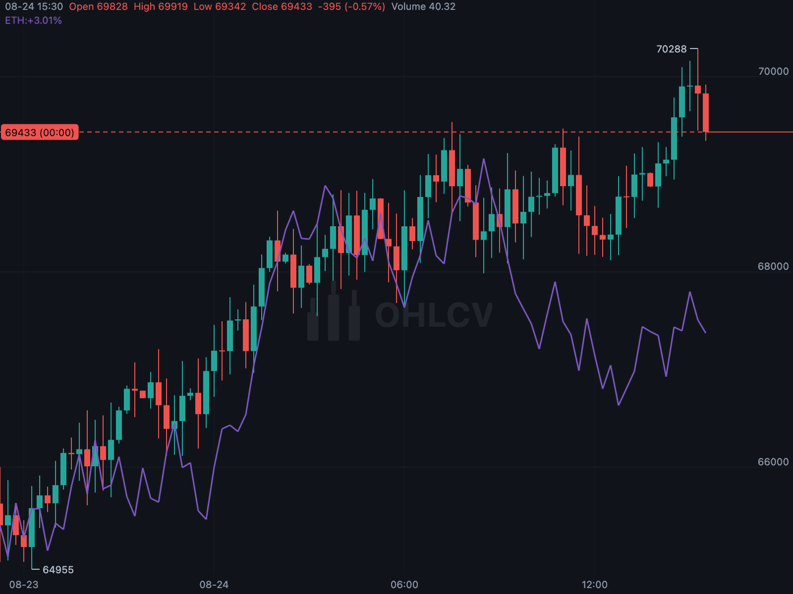
comparisons overlays other instruments on the main chart as lines. Each
ComparisonSeries is rebased by default: aligned to the main series at the
left edge of the visible window, so both lines start together and their
divergence shows relative performance. The anchor moves as you pan, so the
comparison always reflects the visible period.
KChartWidget(
  btcCandles,
  ChartColors(),
  comparisons: [
    ComparisonSeries.ofCandles(label: 'ETH', candles: ethCandles),
    ComparisonSeries(
      label: 'DXY',
      points: [for (final p in dollarIndex) (time: p.time, value: p.close)],
      color: Colors.tealAccent,
      style: LineStyle.dashed,
    ),
  ],
);
ComparisonScale.price plots the series at its actual prices on the same axis.
Use it only when both instruments share units — for example, a future and its
spot price, or two tenors of the same curve.
- Points are matched to candles by timestamp, not position, so instruments with different bar schedules align correctly. Each candle uses the last point at or before its time.
- Gaps in the data break the line.
- Candles before the comparison's first point show no value.
- The price range expands to include all comparisons.
- Each comparison has its own legend row showing its percentage change.
- Colours are assigned from
ChartColors.comparisonColorsunless the series specifies one.
For custom rendering, the following functions are exported:
| Function | Purpose |
|---|---|
alignComparison |
Aligns a series to a list of candles |
comparisonAnchor |
Computes the rebasing anchor for a window |
comparisonPriceAt |
Maps a value to its plotted price |